

01/ DETAILED DESIGN
Alamo Mobile App
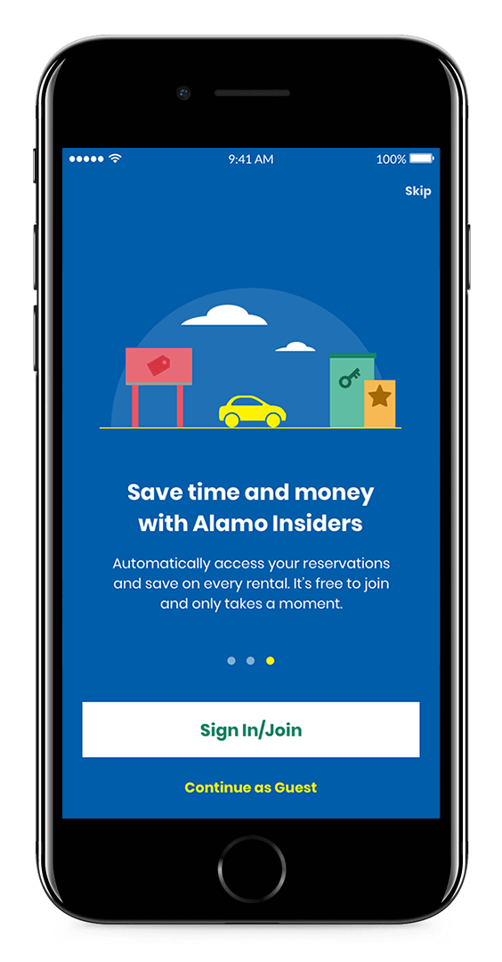
Alamo Rent A Car was the only major rental car company that was not represented in the app store. Our task was to design a focused and simple reservation app for the once-a-year renter. Visually, we were tasked to move away from stock photography or custom illustration to help the Alamo content team become less dependent on those resources. The final system uses bold color and block iconography to lead the users through their flows in an instructional and clear way. Expanding on the brand colors and using primary illustrations, the app is playful and helpful—all in one.

With the goal of having focused moments combined with seamless transitions, the reservation flow moves our users forward with every click. We wanted to provide a linear reservation path so that infrequent renters could complete their process step-by-step.

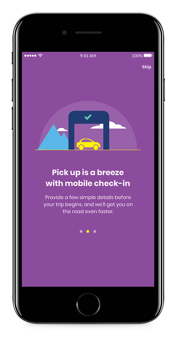
Creating a reservation landing page was a crucial design decision in our Reservation Flow Sprint. We wanted users to feel like they were actively filling out a form, but visually call out areas that needed their interaction. Color was helpful in doing this: Yellow indicates actionable elements, Purple shows your selections, and Green means “Go”.

Being a family brand means that people expect to have fun, while also being cared for. Through the use of circular vignettes, we included illustrative moments to bring life to more informative pages, like Vehicle Details (above) or Customer Support (below). This was a way for Alamo to keep their whimsy without using photograph or custom illustrations.

Even if a user was to only use the app once, our system allows them to customize their experience to best suit them. The smaller circular system brings Alamo’s secondary brand colors out and helps orient users as to where they are within the app. These icons have also been adopted by the Alamo team for their web presence and email blasts for a more consistent way-finding system.
02 / CONCEPTUAL DESIGN
We want to push our brand forward without being dependent on custom illustration and stock photography.
As Art Director on the account, I was able to begin the first round of conceptual designs on my own. The things I knew that Alamo wanted was to keep their friendly and lively personality of a brand, but start to stray away from feeling to confined to customized illustrations or stock photography. We presented three boards, which all came to unanimous vote as to which the winner was. "Blue and Bold" was expressive through it's choice of typography, block colors, and bulky icons. Once chosen, I did a brief conceptual pass at screens and our team created a Sizzle Reel to show the potential of what the app could be.

Storyboard Design & Voice Over Work | Steph Wulz
Motion Graphics | Todd MacLeod
Blue and Bold | Designed by Steph Wulz
Illustrative and Imaginative | Designed by Steph Wulz
Clean and Affordable | Designed by Caite Schultz