OUR CLIENT ASK
An incredibly successful retail experience was missing out on a lackluster digital footprint. So we helped them match it.
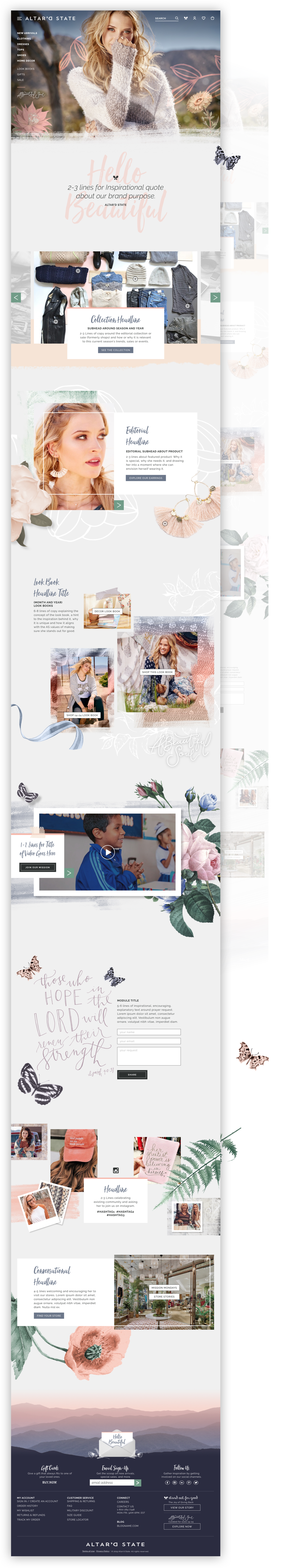
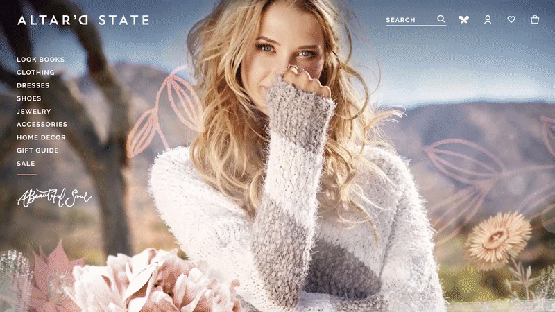
Altar’d State longed for a website that reflected their in-store experience—but were unsure how to go about it. They had a hard time envisioning the same kind of layered, welcoming, and personal feeling they had developed over the years in their physical spaces working digitally. We worked closely with them to understand the choices made in-store (the why) and strategized how to apply those same intentions to a digital space.
OUR APPROACH
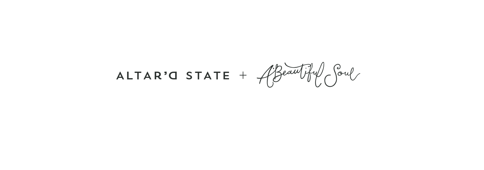
We needed to package two brands under one umbrella, while still keeping them unique and special.
Our solution was to create one flexible template with two palettes. The core retail flow remained the same between the two brands, where our homepage and editorial pages shifted in color and layered elements. Altar’d State and A’Beautiful Soul were designated specific illustration styles and colors so that when we delivered the site, the content authors knew how and when to use which elements.
OUR TEAM
Spread across CHI, NY and BOS, our team worked together to design out this multi-page site in under two months.
As an Art Director, I joined a visual team of two: an Associate Creative Director (ACD) and a Senior Visual Designer at the end of Conceptual Design Phase. My ACD played up to a Creative Director and I played up to an ACD in order to gain the valuable experience of presenting to the client, managing and directing other designers, and constantly ensuring our design system stayed true to our promised intent.
There were a lot of times where I found moments to connect and push thinking with UX and played a very heavy handed UX role during this experience.
OUR RESULT
Since launch, revenue is up 40% over the same period last year.
OUR DESIRE
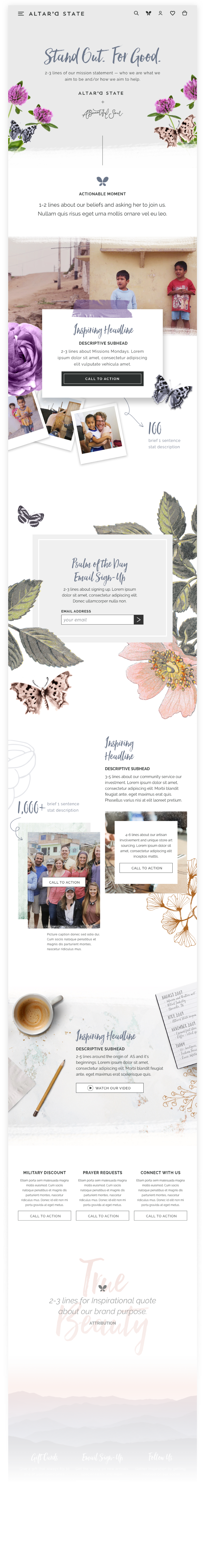
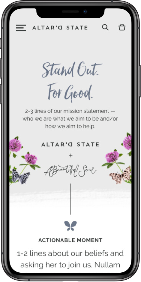
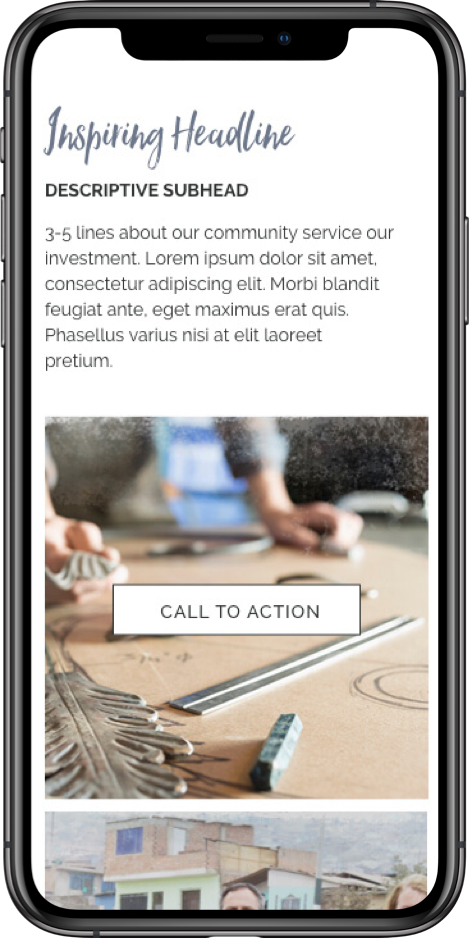
One important aspect of the redesign was to make space to tell about the philanthropic channel of Altar’d State.
Our client is woven into the fabric of their communities and have so many internal efforts to help others that we wanted to find a space where they can share their inspiring stories with their shoppers. Whether it be highlighting the local artists they commission work for their store or showcasing mission trips from their Mission Monday efforts, the Stand Out For Good page developed into the landing page of all of their success.